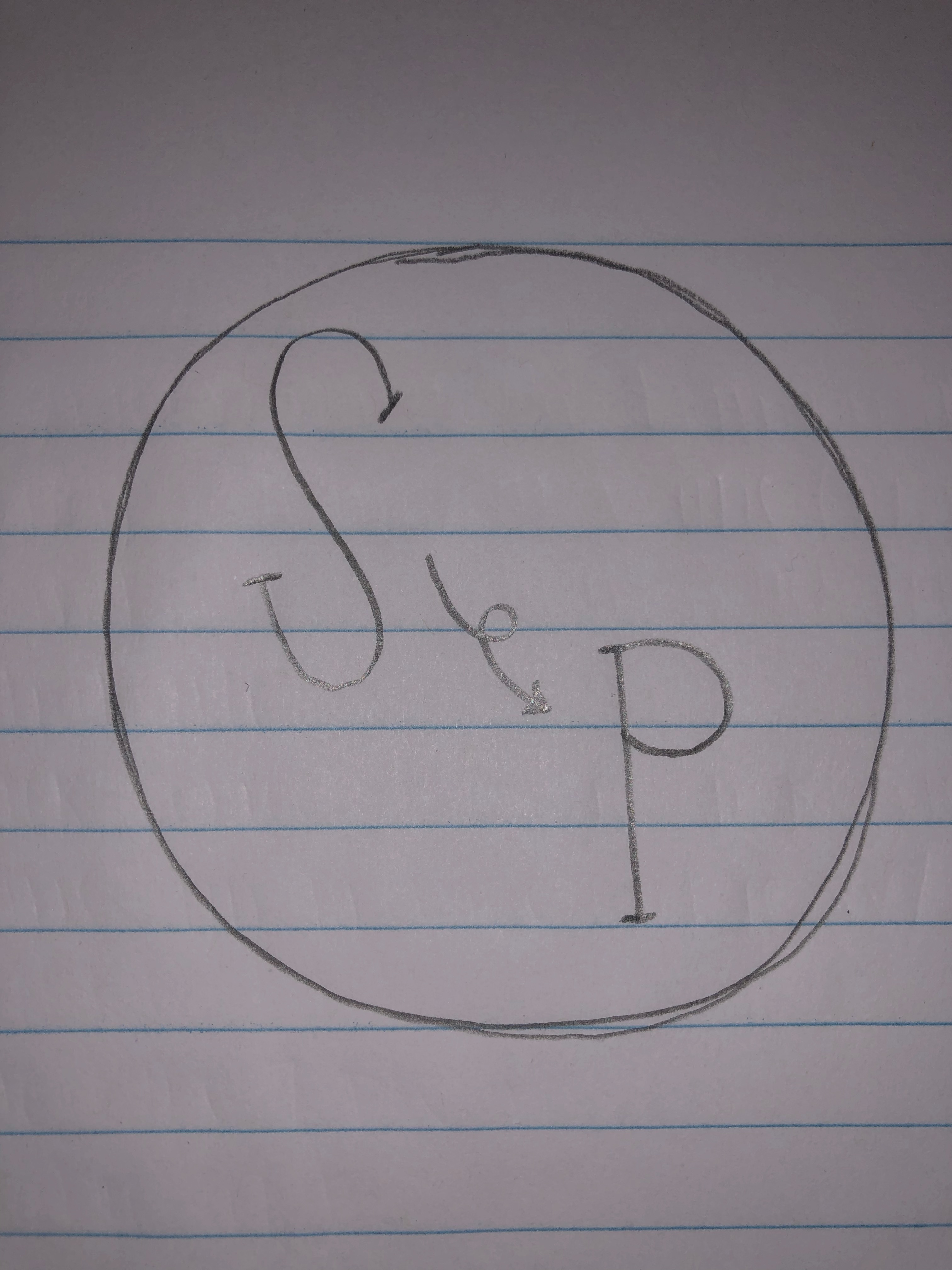
My idea for my logo is to have an “S” for Seattle and then an arrow going to the “P” for Pullman. The circle around it, I think, works perfectly because it could go on a business card, poster, or everything else a logo would need to be used for.
Illustrator Tutorials


Final Graphic Design Project

For this Graphic Design project, I decided to create a poster illustrating moving from my hometown of Seattle, to my new home in Pullman. Seeing as my topic is focused on living away from my family and moving away for college, a poster filled with pictures from both Seattle and Pullman seemed relevant and interesting to me. I have never really distinguished the difference between the two places, and this project is giving me the opportunity to do just that.
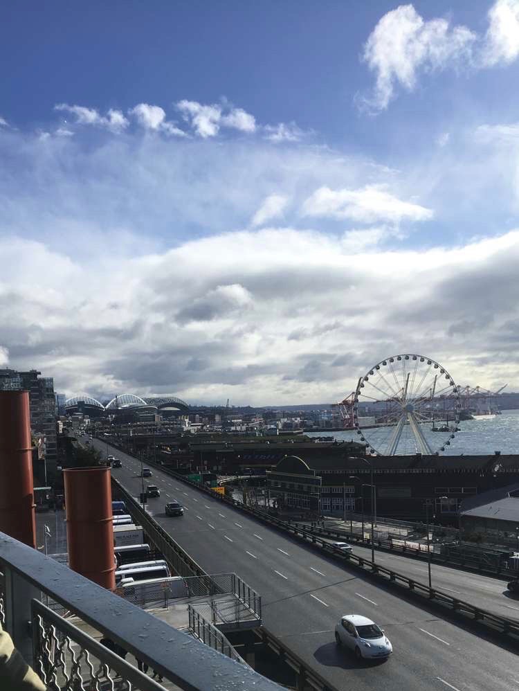
Looking through people’s past projects from previous semesters inspired me to go with the poster look. There were so many beautifully designed ideas, but personally, I think I can be the most creative by simply making a poster and spicing it up as much as I can. I did not research a ton before coming up with my idea, but I, instead, thought about the different posters I have seen in my lifetime and which ones have constantly stuck with me. I want someone to look at my poster and have it be one that sticks out at them and be something they will remember forever. The elements in my design are very significant to my poster. I think putting photos of both Seattle and Pullmans shows the beauty in both places in a combined fashion, but also standing on their own. My design process is more simple than most. I decided to just use layers and start by contrasting the saturation of the colors in each of my photos. I started having the Seattle photo be black and white because I thought it looked better, but after receiving feedback from my peers, I realized it just dulled the photo, so I decided to add color to this city that is full of life. I also used the free transform tool to make the Pullman photos more transparent and blend together better with the Seattle photo. I wanted to take away some of the emphasis on the Pullman photos so that the Seattle photo stuck out just as much as the Pullman ones. To finalize my poster, I used the paint brush tool to add the white, glowing lines in between my text to show that I started in Seattle and moved to Pullman.
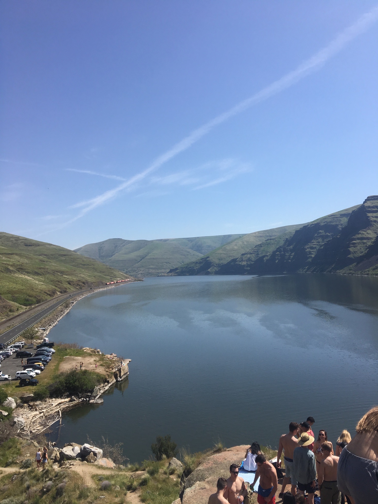
Collecting photos for this was quite simple. I absolutely love taking pictures, so finding good times and places to take pictures of such pretty places was honestly pretty fun for me. Sunset is my favorite time to take photos, hence the reason two out of the three photos were taken at sunset. I didn’t use too many tools in the Adobe Software, but just the right amount to pull my poster together. I cropped the photos and used rotation to put each one at a slant. I also added saturation to bring out the coloring in each photo. One problem I ran into was finding tools on the side. I realized that you really have to just hover over the objects and a title and information of what each tool does is exemplified. Another problem I faced was figuring out how to round the edges of the photos, but with the help of my TA, we watched a tutorial on how to do it and I ended up just making the photos more transparent because I felt it looked better with the overall look of the poster.
Graphic Design Draft

Ideas and Inspiration:
For this Graphic Design project, I decided to create a poster illustrating moving from my hometown of Seattle, to my new home in Pullman. Seeing as my topic is focused on living away from my family and moving away for college, a poster filled with pictures from both Seattle and Pullman seemed relevant and interesting to me. I have never really distinguished the difference between the two places, and this project is giving me the opportunity to do just that.
Looking through people’s past projects from previous semesters inspired me to go with the poster look. There were so many beautifully designed ideas, but personally, I think I can be the most creative by simply making a poster and spicing it up as much as I can. I did not research a ton before coming up with my idea, but I, instead, thought about the different posters I have seen in my lifetime and which ones have constantly stuck with me. Thinking about the end result of this project, I want someone to look at my poster and have it be one that stuck out at them and be something they will remember forever. The elements in my design, as I work towards making them even better, will be very significant to my poster. I think putting photos of both Seattle and Pullman will show the beauty in both places in a combined fashion, but also standing on their own. In the moment, my design process is very simple. I decided to just use layers and start by contrasting the saturation of the colors in each of my photos. As I work to make this even better, I plan on cutting and blending the photos and making the colors shine in their own individual ways.
Collecting photos for this was quite simple. I absolutely love taking pictures, so finding good times and places to take pictures of such pretty places was honestly pretty fun for me. Sunset is my favorite time to take photos, hence the reason two out of the three photos were taken at sunset. As of now, the tools I used in the Adobe software is very minimal because I wanted to start at a basic level and progress my project over time. I cropped the photos and used rotation to put each one at a slant. I also added saturation to bring out the coloring in each photo, while bringing the background saturation down to have a good backdrop base. The only problem I ran into was finding tools on the side. I realized that you really have to just hover over the objects and a title and information of what each tool does is exemplified. As this is a rough draft, I am very excited to continue on making this poster look absolutely amazing and something people will remember forever.
Image Collection


My idea for the Graphic Design project is to make a poster or brochure cover with pictures from my hometown, Seattle, and pictures of my new home, Pullman, and adjusting to my new lifestyle.
Photoshop Tutorials


Here are my completed tutorials. Hope you enjoy!
Introduction to Living Away from Home
The topic I chose to focus on this semester is how college students cope with living away from home and being home sick. I chose this topic because almost all students at some point in their college career become homesick or struggle with living away from their families. Personally, this topic was relevant in my life when I first moved went off to college and I think touches almost everybody in some way, shape, or form. I wanted to set myself up for success when choosing a topic I would be focusing on for the entire semester. To collect photos, audio, and video footage, I plan on using pictures taken showing homesickness during my first semester away, cards written and received from family and friends, evidence of FaceTime and regular calls, and many other resources helpful for this topic. For unit 3, the Adobe Audition unit, I plan on interviewing some of my sorority sisters on whether or not they have ever felt homesick and what they did to cope with that sadness. For unit 4, the storytelling portion, I plan on asking more in depth questions as to how people truly felt about moving away from their families and living on their own. I would like to share some of my inspirations as to why this topic attracted me, so below are some links to other blogs and articles I read regarding the situation. The first blog spoke to me because the author talked about how moving away was extremely difficult, but also the best thing that has ever happened to her. That is exactly how I felt, so I thought the article was very inspirational. The second article is a list of five tips on how to cope with living away from your families, which I believe everyone should take a look at if you ever need advice. The last blog discusses the top worries college students have on their minds when heading off to school. After reading it, I know those fears were ones that were constantly on my mind when I was getting ready to move away, so I found the article very useful and I am sure most people will as well.
https://www.readyeducation.com/blog/5-tips-for-students-away-from-home
About Me

My name is Ashley Moriarty. I was born and raised in Seattle, Washington. I am currently a second semester sophomore at Washington State University. Here at Washington State, I am apart of the Delta Gamma sorority. Joining a sorority was one of the best decisions I have ever made and has bettered me as a person more than I ever would have imagined. Because of this, I feel inspired to write about the building of communication skills and share my stories as to how I have built life long friendships by having these skills. Some of my interests include helping others through philanthropical events. Growing up, my grandma always taught me how important serving the less fortunate is, and that is something that will always stick with me. Over the last year, I have continued to work with the company Nordstrom. I have greatly enjoyed my time with them and I am hoping I can climb the ladder with the company once I finish my time at Washington State.
