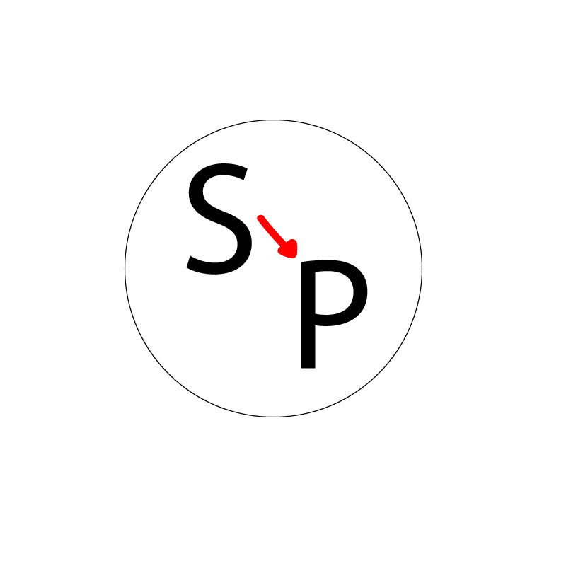
For my logo design project, I decided to create a circle with lettering on the inside. I chose the circle because it is very scalable and can go on business cards, be used for stickers, can be put on big and small things, along with multiple other uses. This logo relates to my topic because the “S” stands for Seattle and the “P” stands for Pullman. The arrow in the middle is used to represent the move from Seattle to Pullman.
My design process was pretty simple for the most part. I researched the different types of logos that companies use and read reviews as to what designs they said worked best and which ones did not end up working so well. After reading some reviews and browsing through different logos, I came to the conclusion that using a circle as the main portion of my logo was the best fit.
I used pretty basic tools in Illustrator for the most part. I started by using the ellipse tool to create the outline of the circle. I then used the text tool to type the “S” and the “P.” The font was initially very small on the letters, so I had to adjust it to fit the circle. The final number I came to for the font was 225. I then used the paint brush tool to draw the arrow separating the two letters. I chose the color red because I thought it was fitting for the Washington State Cougars. I actually didn’t experience any problems while using Illustrator; everything was pretty self explanatory and easily accessible.

Ashley, your logo is very simple but easy to understand once I started reading your explanation. In order to make this understandable from just looking as a first critical suggestion I have for you is to add an outlines map of Washington instead of a circle and you could show the locations of Seattle and Pullman then the arrow connecting the two. The other critical suggestion I have for you is to make the circle outline thicker if you keep the circle instead. This will create more dimension to your logo and maybe even adding some color too. The specific area where your design is already really strong is how simple your logo is. The simplicity of it makes the reader want to go further into your project in order to find out what it means and what your topic is about. Overall, I think you did a great job and I’m excited to see the final product, good job!
LikeLike
I appreciate the simplistic potential that this piece has to offer. It is obvious that the vector line placement as well as the various usages of geometric shapes to add deeper dimension to the logo.
The soft bubbling effect that is produced by the use of the deeper cream background lends itself to a vintage feel.
Pros:
– The color selection allows the work to speak for itself without being too loud or over crowded.
– The overall message of the piece is clear and accurately communicated using the vectors and geometric tools.
Things to consider:
-sharpening up the arrow in between the letters will help with the visual texture and consistency throughout the project.
– perhaps implementing a solid background to make the logo stand out.
LikeLike
The feedback from my peers was extremely helpful as I go into finalizing my logo. There were a bunch of helpful tips I got and I plan on changing a few things to make my logo look perfect. The first thing I am going to change is the stroke of the circle. I want to make it larger in order to put more emphasis on it because right now it looks very small and weak. Another thing I am deciding whether or not to do is to make the whole circle black and make the letters white. I have to play around with Illustrator a little more to decide if that is the direction I want to go down. I am also planning on changing the font of the letters because after looking over my draft again, my font choice is very bland and boring. The last thing I am going to do in order to perfect my project is make the arrow a looped arrow, just to add a little extra something into the circle.
LikeLike