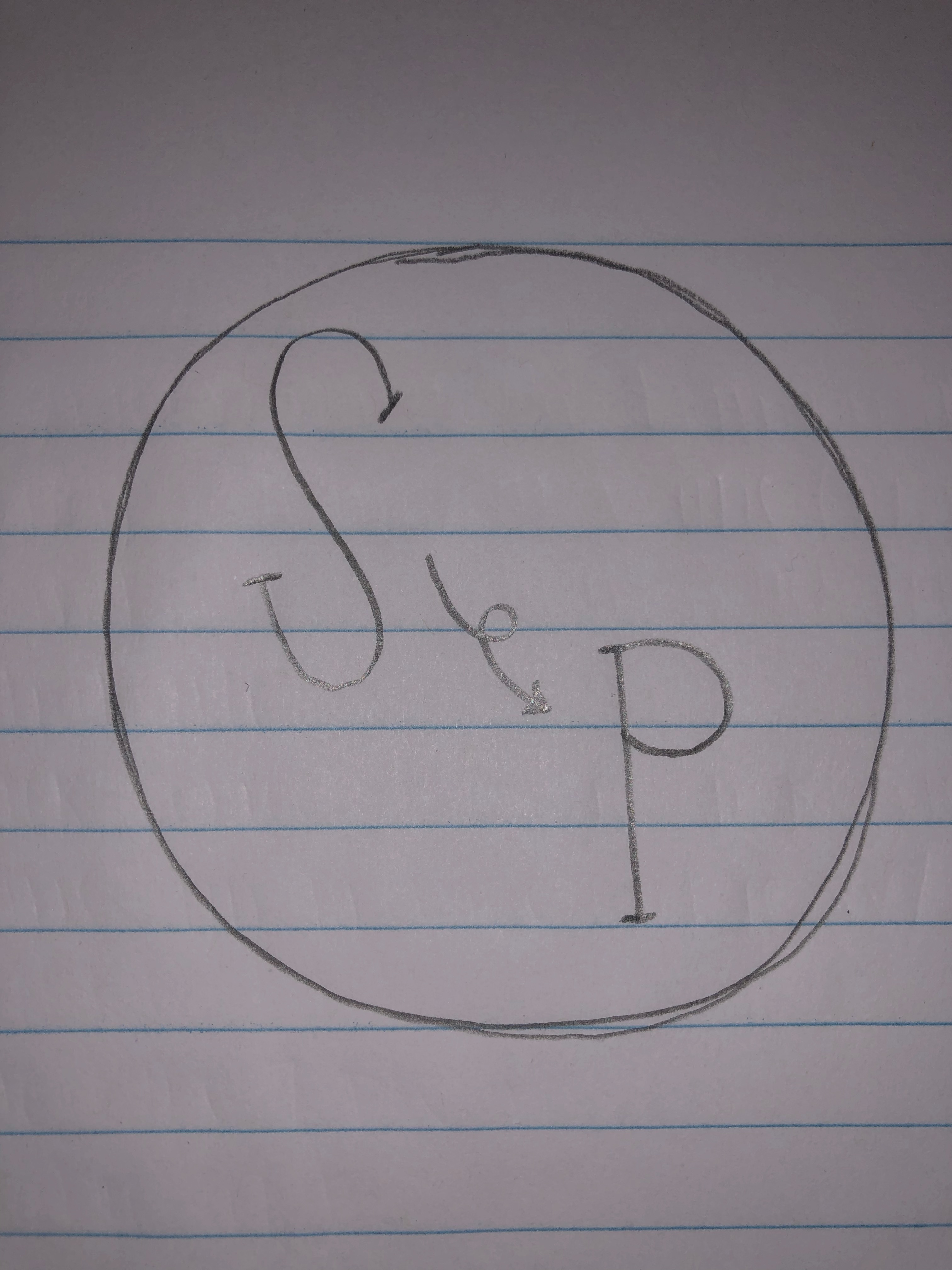
For my logo design project, I decided to create a circle with lettering on the inside. I chose the circle because it is very scalable and can go on business cards, be used for stickers, can be put on big and small things, along with multiple other uses. This logo relates to my topic because the “S” stands for Seattle and the “P” stands for Pullman. The arrow in the middle is used to represent the move from Seattle to Pullman.
My design process was pretty simple for the most part. I researched the different types of logos that companies use and read reviews as to what designs they said worked best and which ones did not end up working so well. After reading some reviews and browsing through different logos, I came to the conclusion that using a circle as the main portion of my logo was the best fit.
I used pretty basic tools in Illustrator to complete the look of my logo. I started by using the ellipse tool to create the outline of the circle. I decided to thicken the stroke in order for the circle to have a more powerful look to it. I set the stroke at a 10. I then used the text tool to type the “S” and the “P.” The font was initially very small on the letters, so I had to adjust it to fit the circle. The final number I came to for the font was 225. I also changed the font to give my logo a little more style. I then used the paint brush tool to draw the arrow separating the two letters. I chose the color red because I thought it was fitting for the Washington State Cougars. I ended up changing the arrow from a straight arrow to a looped one because I thought it looked better and more professional; it also added a little extra something. I actually didn’t experience any problems while using Illustrator; everything was pretty self explanatory and easily accessible.